Why Your Contact Form Is the Last Step Losing You Leads
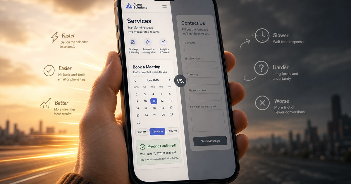
There is a moment every site visitor reaches where intent is highest. They have read your services page, they believe you can help them, and they are ready to act. Then they hit a contact form asking for their name, email, phone number, and a message they have not composed yet, with no indication of when you will respond. On mobile, that moment evaporates in seconds. The visitor closes the tab and moves on to someone else.
This is not a conversion rate optimization problem in the abstract sense. It is a friction problem built directly into how most small business sites are designed. A contact form made sense when visitors were mostly on desktops, reading carefully, and willing to wait 24 to 48 hours for a reply. In 2025, that assumption has aged poorly. Research cited by scheduling tool providers consistently shows businesses with self-scheduling options see up to 40 percent fewer no-shows compared to those relying on form submissions or phone callbacks. The reason is straightforward: when someone can lock in a specific time immediately, the commitment is real. A submitted form is just a request with no confirmed outcome.
The Form Is Not the Problem. The Gap Is.
The issue is not that contact forms are inherently bad. It is that they create a gap between interest and action with no bridge across it. A visitor who fills out a form is handing you their intent and walking away to wait. That gap, whether it is four hours or four days, is where leads go quiet. They forget, they find an alternative, or they simply cool off. The form gave them no reason to stay engaged.
This is where the structure of your site matters as much as the design of your form. A custom-built site can surface a scheduling option at exactly the right moment, without interrupting the reading flow or burying it behind a navigation click. When the call to action is a real, bookable meeting rather than an empty submission field, the visitor knows exactly what happens next. That clarity alone changes behavior. Tools like JavaMe exist precisely for this: moving the first interaction off an asynchronous form and into a scheduled, face-to-face moment that feels like a commitment rather than a coin toss.
What a Schedulable CTA Changes
When you replace the contact form as the primary conversion point with a direct scheduling option, you compress the sales cycle at its most fragile part. The visitor does not need to compose a message, guess at your availability, or wonder how long a response takes. They pick a time, confirm it, and the meeting exists. That shift is not cosmetic. It changes how the visitor experiences your site’s credibility. A business that can offer a real meeting in two clicks reads as organized, available, and confident. A form with no promised response window reads as uncertain.
For small businesses and independent professionals, especially those in service industries where the first conversation is effectively the audition, getting that meeting scheduled before a competitor does is the entire game. The site should be doing that work actively, not passively collecting submissions and hoping for follow-through. If your current site treats the contact form as the finish line, it is time to reconsider what the finish line should actually look like.
Build the site that closes the gap. See what that looks like at concepcion-design.com.
